Changelog
May 20, 2025
0.27
0.27
May 20, 2025
Supercharged Tables & Improved Styling#
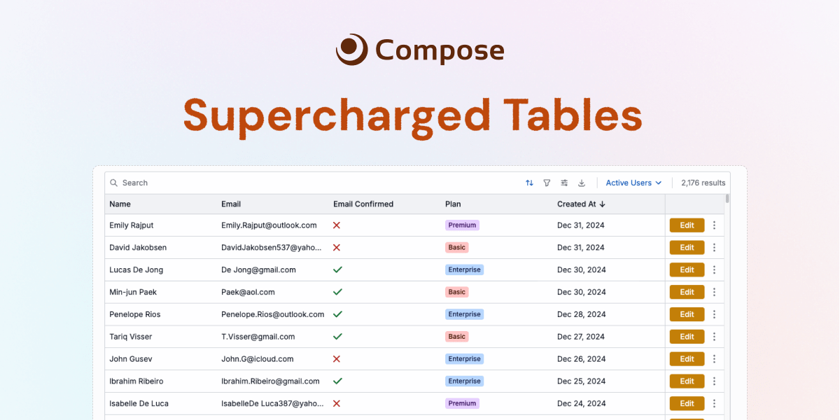
Table Data Controls
- Multi-column sorting: Built-in support for sorting table data by one or more columns.
- Advanced column filtering: Built-in support for applying advanced filtering logic via column filter rules, and filter groups that allow you to combine multiple filters.
- CSV Downloads: Built-in support for exporting table data to CSV with a single click, with options to include/exclude hidden columns and/or selected rows.
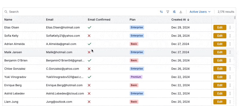
Table Styling
- Overflow behavior: Keep table rows organized by controlling how content overflows the row cell. Content will be truncated with an ellipsis by default, with an option to preserve the old behavior of expanding the cell height via the new
overflowproperty. - Density: Control the density of rows via the new
densityproperty. Three options are available: compact (32px row height), standard (40px row height), and comfortable (48px row height). - Pinned columns: Use the table toolbar or SDK to pin one or more columns to the left or right of the table, useful for keeping important columns visible while scrolling.
- Hidden columns: Use the table toolbar or SDK to hide one or more columns from the UI. Useful to keep the UI clean, while preserving the option to display the column when desired and include the column data in CSV exports.
- New JSON column format: Use the new json column format to render the cell data as a formatted JSON block, and improve filtering and sorting of JSON data.
Table Views
- Define preset configurations of data (filtering, searching, sorting) and UI (column pinning, hiding, cell overflow) controls for different use cases, allowing users to quickly switch between these views in a single click.
- Set a default view for a table, which allows you to set default sorting, filtering, and other configurations while allowing users to change these settings as needed via the table toolbar.
Table row selection
- Select multiple rows at once using shift-clicks.
- Use the new primary key property in the SDK to track row selections via a stable, unique identifier in the table data, enabling selections to be persisted correctly when the table data is updated.
More Table Improvements
- 2x improvement to scrolling performance. This is especially apparent for tables with many rows.
- Improved logic to auto-recognize date formats within table data.
- New
appearanceproperty for table actions to customize the appearance of the action button/dropdown element.
JSON Input Component
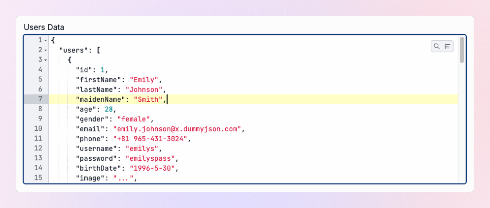
- Easily collect and edit JSON data inside a purpose built component with built-in syntax highlighting, data-formatting, search & replace, and line numbering.
- Reduce bugs with built-in validation to ensure well-formed JSON.
Mobile-responsive layouts
- All layout components are now mobile-responsive by default, meaning horizontal components such as
ui.rowwill automatically rearrange their children into a vertical stack on mobile devices. - Responsiveness can be turned off for any layout component via the new
responsiveproperty available with every layout component.
Statistic Component

- Render numerical data inside a beautifully designed modern card component with a large, bold number, a label, and a description.
- Support for delta values, which show changes from a previous value.
- Support for a multitude of different number formats, custom prefixes, suffixes, and more.
Divider Component
- Render a simple, well-designed divider line to visually separate content.
Other Improvements
- Big quality of life improvement: most input components now allow on change callbacks even when inside a form. If the component doesn't support it, you'll see a warning on the screen, instead of a silent failure.
- A new update algorithm within the SDK should greatly reduce situations where the UI is not properly updated after a data change, especially if the error was due to an update-by-reference bug. Additionally, the new algorithm is slightly faster than before.
- Added text highlighting to the PDF component.
- Updating the initial value of an input component, then calling
page.update(), will now properly update the value of the component. This also enables us to deprecate thepage.setInputs()method (though it will still be supported during a long transition period).
Breaking Changes
- New default pagination threshold is 2500 rows, reduced from 5000.
- New default cell overflow behavior is to truncate the content with an ellipsis, instead of growing the cell height. Re-enable the old behavior by setting the table
overflowproperty todynamic. - Paginated tables will be NOT searchable by default. Search can be enabled for paginated tables by explicitly setting the
searchableproperty to true. - Tables will no longer render a row selection column by default. Row selections can be turned on by setting the
selectableproperty to true, or by adding an on change listener to the table. - The
allowSelect/allow_selectproperty has been deprecated for the table component. Use theselectableproperty instead. Note: the property will still be supported during a long transition period to avoid issues for existing users. - The
page.setInputs()/page.set_inputs()method has been deprecated. Instead, update the initial value of the input component, then callpage.update(). Though deprecated, the method will be supported during a long transition period to avoid issues for existing users.
March 12, 2025
0.26
0.26
March 12, 2025
Introducing Sidebars#
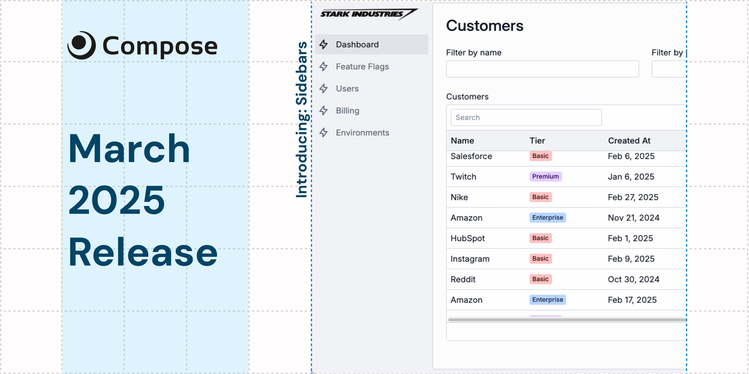
A New Primitive: Sidebars
End-to-end TypeScript
Forms in the TypeScript SDK are now fully typed based on the form elements. No configuration required.
2x faster Python SDK
For Each Component
Debug Mode
As developers create more complex tools using Compose, we've introduced a new debug mode with accompanying documentation to help debug situations where the SDK is not performing as expected by logging internal ops and performance metrics to the console.
Other Improvements
- Introduced a new onboarding experience allowing devs to install Compose with a starter app using a single terminal command. Go to app.composehq.com/home/onboarding to try it out.
- Add better typing to individual input callbacks in the TypeScript SDK.
- Inputs are better optimized and will no longer zoom unnecessarily on mobile devices.
Bug Fixes
- Fixed bug where number input would not allow negative numbers.
- Fixed bug where modals were not scrollable in rare cases.
- Fixed bug where bar chart would update with incorrect data in cases where the series changed.
- Fixed bug where parent app permissions would not apply to a sub-app for public facing apps.
Breaking Changes
None!
January 16, 2025
0.25
0.25
January 16, 2025
Charts, Dark Mode, and More#
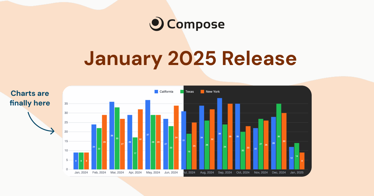
Visualize with Bar Charts
Every App is Dark Mode Ready
Scale Endlessly with Paginated TablesScale with Paginated Tables
Categorize Data with Table Tags
format: "tag" and let us figure out the colors, or customize them yourself. Learn moreSimplified, More Powerful Forms
You can now create forms with 30% less code than before. First, forms will automatically include submit buttons without you adding one manually. Second, inputs will now infer labels from the input key.
Other Improvements
- Overhauled documentation website to include detailed parameter descriptions for every single component.
- Added roles to the platform (e.g. owner, admin, member, etc.) to allow teams to more granularly control permissions.
- The table actions row is now stickied so that it's always visible regardless of how many columns you have in your table.
- Added stack traces to errors in the Node.js SDK.
- Improved modal behavior. Modals will now close when clicking outside of them or hitting the escape key.
- The
ui.condcomponent will now evaluate for truthiness, instead of requiring boolean inputs.
Bug Fixes
- Fixed minor bug where the UI would not update from a
page.update()method call in rare cases. - Fixed minor type errors in the Python SDK.
- Fixed formatting issues where components would not render correctly when part of complex layouts.
Breaking Changes
None!
December 16, 2024
0.22
0.22
December 16, 2024
Faster Tables & More Input Components#
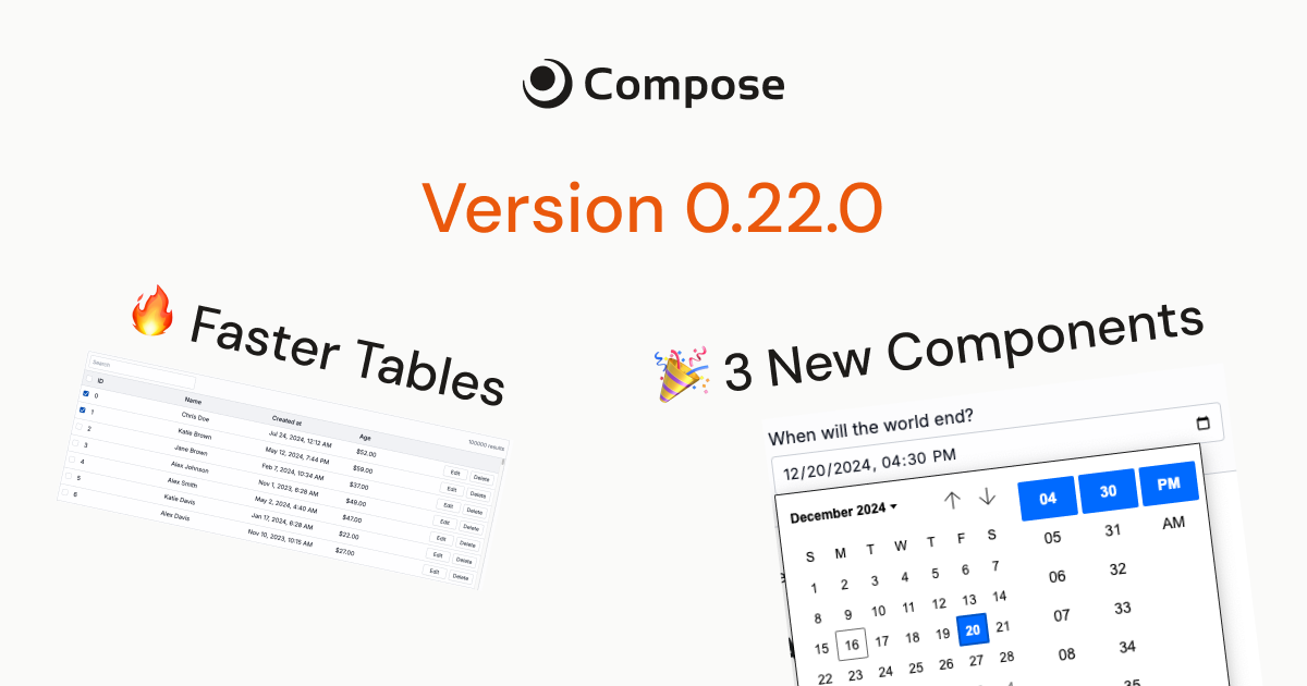
Tables load way faster
We've introduced a new compression algorithm that significantly decreases the packet size when transmitting tables between your server and the browser. You can expect to see up to 4x faster table loads, especially for larger tables.
DateTime Input Component
Time Input Component
Checkbox Component
Other Improvements
- Table row actions will now pass the row index as the 2nd argument to the action function.
- Better errors in the Python SDK with full stack traces where possible.
- Better type hinting and intellisense in both the Node.js and Python SDKs.
- Clearer form error messages
Bug Fixes
- Fixed minor bugs with the page set input method that would crash on certain input types.
- Fixed bug in python SDK that required hook functions to consume all input parameters. You can now consume 0, 1, or more parameters depending on the hook function.
Breaking Changes
- Node.js SDK: The return type of the
ui.dateInputcomponent has changed from a JS Date to a JSON object with numeric keys to represent the data, alongside ajsDateproperty that represents the selected date as a JS Date in utc midnight. This change affects thevalidateandonEntermethods for the component, as well as theonSubmitandvalidatemethods for any forms that contain the date input component. Read more in the date input docs.
May 26, 2024
0.1

2026 Compose. All rights reserved.